explain two ways the extract fits the genre of lifestyle magazines. use examples from the extract.
this magazine fits with the genre of a lifestyle magazine because on the front it says 'easy living'.
below the title there is a small amount of writing that makes you read on in the magazine.'easy elegant summer dressing' this makes women read on in the magazine because they want to have the perfect summer clothing.
this magazine also fits the genre of lifestyle magazines because the contents show that the whole magazine consist of lifestyle such as real life, fashion, beauty and emotional intelligence.
explain how each of the following is used in the extract to create effect:
layout
colour
typography
language
the layout of the magazine is very simple but effective to catch someone's eye, the magazine cover consists of a large picture of kylie Minogue filling the majority of the front cover, also small amounts of text surround her face and top half of her body.
the colour scheme is very bright and stands out, i think that they have chosen to do this because the magazine is called easy living, using the word easy suggests that this magazine is quite relaxed and informal.
the language in this magazine also suggests that it is very informal words such as summer's here and sexy also appear in the front cover in large stand out writing.
Thursday 12 June 2014
Thursday 24 April 2014
mock essay

This magazine cover direct mode of address has been used on the picture where the land is looking directly into your eyes to show that this magazine is aimed at you. also direct address has been used in the text which has been enlarged, 'your PARTY dress code' this is also being directly aimed at you the reader.
In this image the whiting has the colour red which can be associated with women. Also the word RED has been highlighted so that it stands out on the page. The writing has been placed on the left hand side of the picture and the image is placed on theright hand side which balances it out.
In the text the more important words are enlarged or highlighted so that you know that this piece of text is important to read or it is a main story. The words that mean less are in white and are a lot smaller than the other highlighted words.
Thursday 27 March 2014


Thursday 13 February 2014
colour connotation homework
 in this magazine they have used the colour green because the colour green stands for acceptance, love harmony, communication and social these are all things to do with gaming.
 in this magazine they have used the colour blue because the colour blue stands for calmness, kindness, emotional depth, inner peace and love this is what inspires you to follow the fashion
 in this magazine they have used the colour pink because this colour means passion, stability, qualities, artistic and imagination it stands out on the page and looks energetic, this make it look appealing so that people will buy it.
Monday 27 January 2014
Thursday 23 January 2014
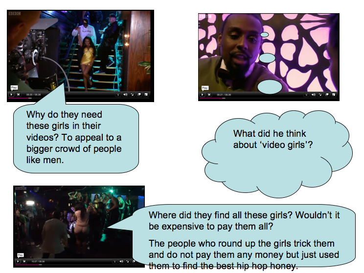
music videos
There are people dancing on strip poles, Rihanna is dancing on a chair in a bikini, they are also all in very revealing clothes. Rihanna is sat in a queens golden and red leathered throne. an avatar is dancing in water shaking her booty to make the water splash.
loads of the shots start zoomed out on Rihanna and slowly zoom in onto her face.
half way through the video the camera has three slit scenes showing two pole dancers either side of Rihanas shot of her dancing on her chair.
britney spears is singin on a driving motorbike.
Monday 20 January 2014
titles for my magazine
titles for my magazine
- teen fashion
- style
- earlyTEEN
- inspiration
- aspire
- teenlife
- allTEENfashion-ATF
- Still at school-SAS
- GossipCHICZ
- SilkyShine
coverlines for my magazine
Coverlines on magazines:
- what and not to wear
- spice up your school wear
- become a fashion guru
- get slim quick
- know what to eat
- 10 facts on keeping fit
- super slim techniques
- boyfriend advice
- quick fashion tips
- how to look fabulous in under 30 seconds
Friday 17 January 2014
typography
- How many
different font styles do you see on the front cover? 24
- How many
different font sizes are used?26
- How many different
font colours are used?3
- How many
coverlines are there?5
- Describe the
font used for the magazine title. The font for the magazine title are bold and large with
a bright colour so that it stands out.
- How does the
title communicate who the target audience are? Girly because it is pink
and the colour pink is associated with women and girls.
- What’s the
main coverline and how do you know?real women sizes 6-16 naked because it
is just below the title.
- Explain how and why different colours are used on the cover. To make certain stories stand out such as the main coverline.
- If you could
change something about the typography on this cover what would it be and
why would change it? balance out each side with more writing and pictures because the left side is heavily unbalanced.

Subscribe to:
Posts (Atom)